Visualizing the Electric Grid
T.J. Overbye, J. D. Weber, “Visualizing the Electric Grid,” IEEE Spectrum, February 2001.
Published in the Februrary 2001 issue of IEEE Spectrum
by Thomas J. Overbye, PhD
University of Illinois at Urbana-Champaign
by James D. Weber, PhD
PowerWorld Corporation
This webpage has been developed in conjunction with the article entitled Visualizing the Electric Grid in the February 2001 issue of IEEE Spectrum magazine (see www.spectrum.ieee.org). Various images and interactive JAVA visualizations can be directly accessed off this website. Simply click on the links below to access these visualizations.
Java Animated Visualizations
Small 30-Bus example
Eastern Interconnect Example
Area Diagram Example
Static Images
-
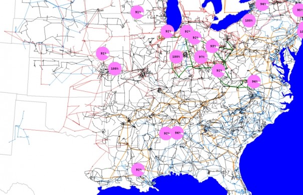
- A picture of most of the 100 kV and above transmission system in the Eastern Interconnect of the United States. The dynamically sized pie charts show lines loaded higher than 90%.
-
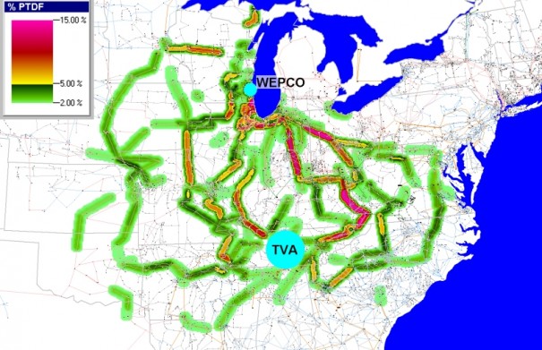
- Colors in this contour map represent Power Transfer Distribution Factor (PTDF) values—the percentages of a transaction that would loop over various grid components—for a hypothetical transfer between a utility in Eastern Wisconsin and the Tennessee Valley Authority (TVA). Values range from 2 percent [green], to 5 percent [yellow], to 15 percent [red].
-
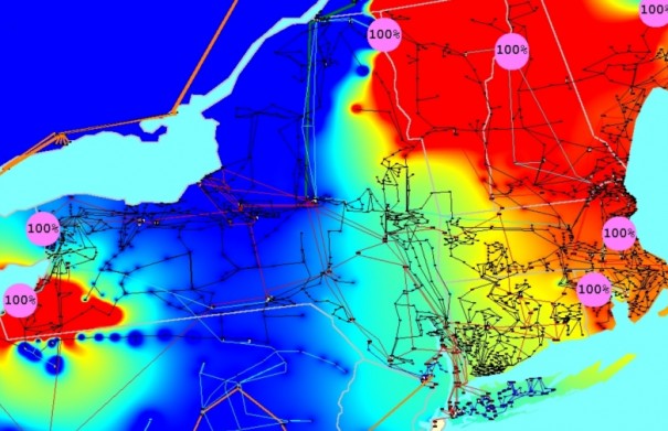
- This picture shows a contour of the spot-prices or Locational Marginal Prices (LMPs) throughout the Northeastern United States. These prices were calculating using an optimal power flow that models 9270 buses. The contour is superimposed on a map of the high voltage transmission lines in the Northeast, and the pie charts indicate which transmission lines or corridors are congested.
-
- Shows the aggregation of data in a one-line diagram by grouping buses in the single graphic object, the substation.
-
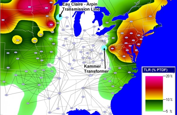
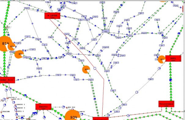
- This contour map highlights salient features of the situation during a major price spike in the Mid West. The ovals represent potential sellers of electricity, and the lines represent abstracted images of transmission routes and tie-lines between the chief operating regions. The contours, ranging in degrees of escalating severity [from green to red], show how much system components would be overloaded if a utility in northern Illinois purchased electricity in the wholesale market. The Eau Claire–Arpin transmission line and Kammer transformer were key chokepoints.
-
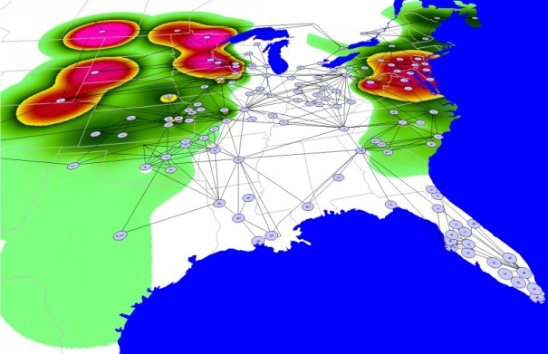
- Same diagram as diagram to the left, except in 3D.
Tags: Technical Papers
February 1, 2001